
.webp)
Just before launch, LePal an AI-powered mental health app for Gen Z, faced a retention crisis: a new premium paywall for its flagship feature caused nearly 90% of beta users to drop off, threatening revenue and ultimately user trust at a critical time. As team lead, I led a strategic redesign to increase free-to-paid conversions by aligning monetization with real user behavior.
.png)
During beta testing, we saw nearly 90% of users abandon the app at the paywall. The culprit? A mix of hidden and unclear pricing, vague value props, and a cluttered interface that made upgrading feel confusing, risky, and not worth it.
.png)
Our goal was to design a paywall that removed any decision friction. It needed to feel effortless for Gen Z users to choose premium, and compelling enough to support LePal’s subscription growth.
With just one week left in our 12-week UX fellowship, I led a 5-person team to quickly address LePal’s paywall challenge. We delivered a tested, research-backed redesign that balanced revenue goals with user needs.
.webp)
Day 1 I outlined our research plan to uncover the root cause of this drop-off. First conducting surveys (30 respondents) along with interviews and usability testing with 3 of our beta users.
With limited incentives and time constraints, we struggled to recruit enough beta users in time. I broadened our reach and created an additional survey guide for the general public that could help us quickly gather more data on the preferences and behaviors of demographics.
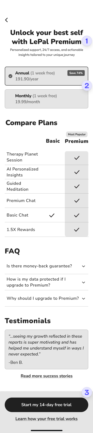
Our paywall wasn't just missing a few elements, it was pretty much striking out on everything Gen Z users needed to feel confident about subscribing; a clear value prop, transparent messaging, and upfront pricing.
.png)
.png)
One of the biggest barriers for our users wasn’t usability; it was cost. Since pricing decisions were outside our scope, I wanted to focus on ways to justify value, ease risk, and build trust around the upgrade decision.
On day 4 I facilitated an ideation workshop with the team to create wireframes based upon our synthesized research findings. Focusing on the layout, structure, and incentives that can improve conversion rates.
.png)

I facilitated a team sketch session where we shared ideas and combined the strongest concepts into V1, which we then iterated into V2 based on quick user feedback. Key changes include:


Turning our design into a clickable prototype, we asked 5 participants to explore the original and redesigned paywall. The goal was simple: see if the redesign reduced hesitation and built enough clarity to make upgrading feel safe.
Combining qualitative and quantitative data, we gathered thoughts, behaviors, and followed up with a survey asking users to rate the clarity, visual appeal, confidence in buying a subscription, and likelihood of subscribing on a five-point scale.
.png)
.png)
.png)
After the fellowship program ended, I sent an anonymous survey to my team to gather insights on what I did well and what I could improve on, both as a team leader and designer.
"Maybe being more assertive in following up with the tasks and motivating people to finish them"
"Managing collaborative sessions, being so organized and on top of things, great communication skills"
"You did great as a team leader, and providing the team with additional information helped greatly in designing the wireframes"
"I loved how you were assigning tasks, managing schedules, providing feedback, and ensuring effective collaboration among team members"
I learned to lead with empathy but keep momentum strong through clearer check-ins with the team.
We hit roadblocks, low research turnout, shifting goals, but stayed focused and iterative.
When you're building trust, fewer words, clearer visuals, and human tone go a long way.